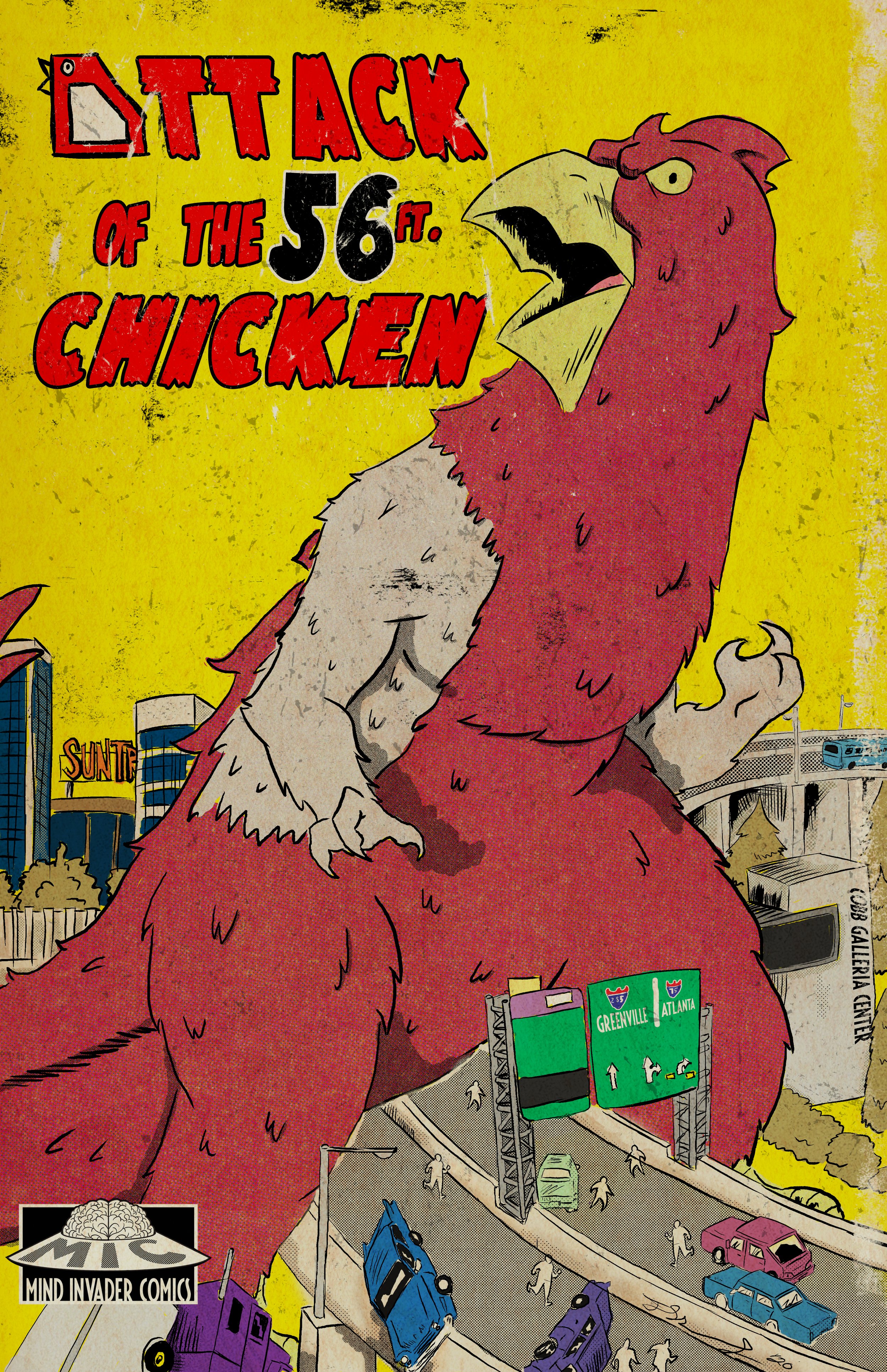
Creating the Colossal Cobbzilla for Attack of the 56-ft Chicken
Greetings fellow seekers! Let me take you behind the scenes of how the concept of Attack of the 56-ft Chicken was hatched after being inspired by a vibrant vintage masterpiece.
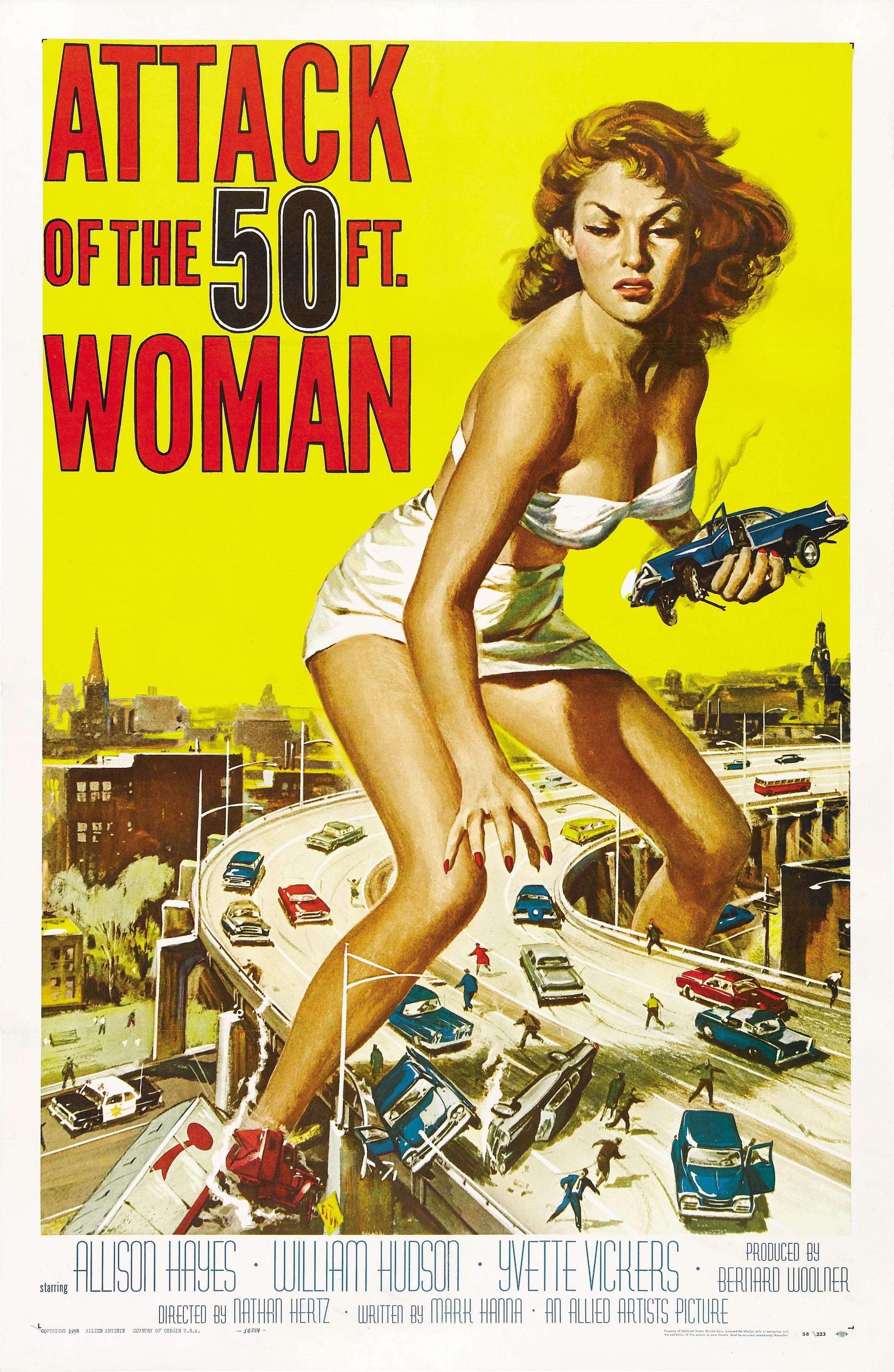
“Attack of the 50ft woman” Drawn by Reynold Brown.
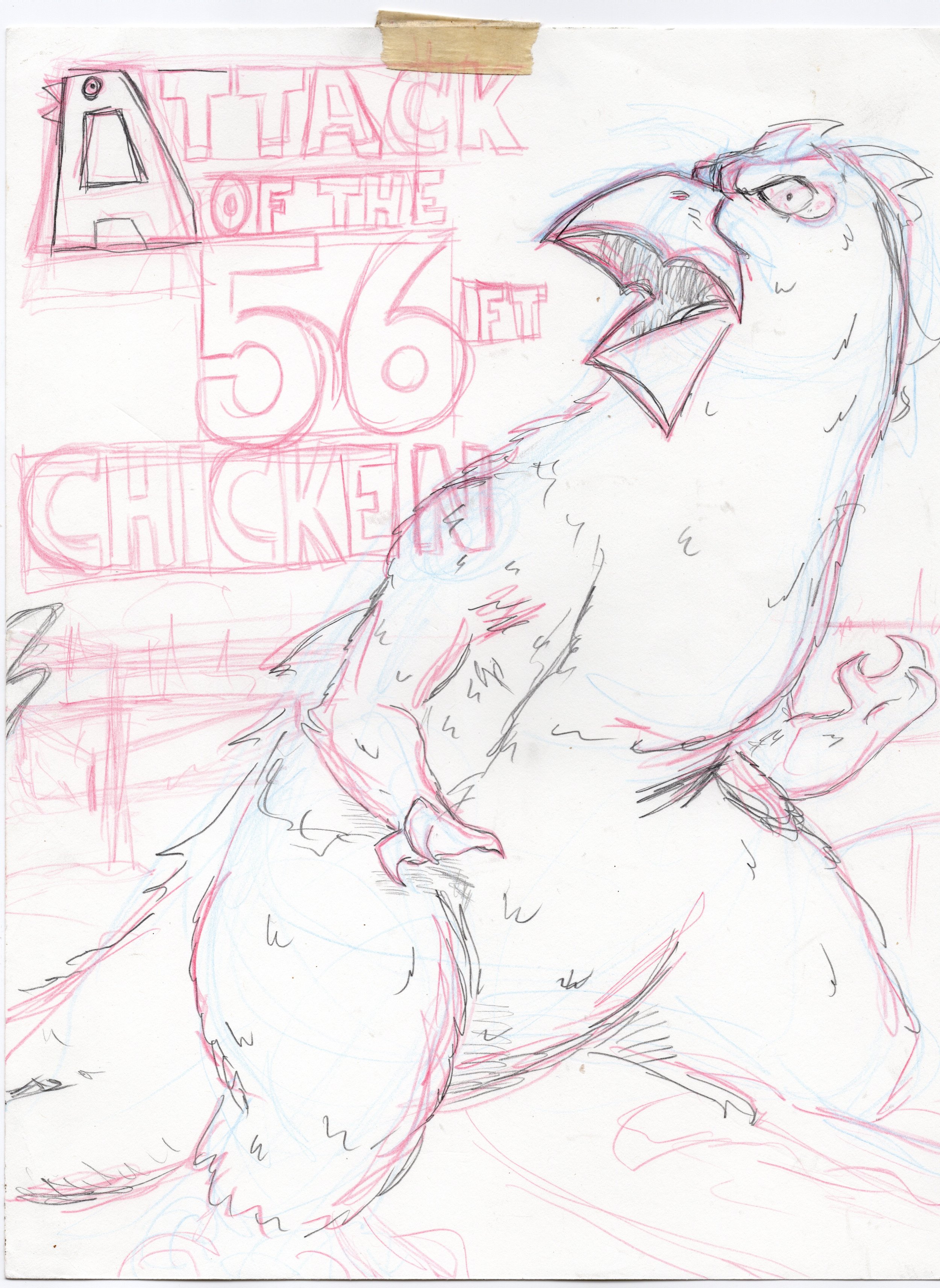
First off, this colossal clucker was born the old-fashioned way: on good ol’ 8x11-inch bristol paper (Strathmore) and a trusty array of pencils (Graphite, colored, and mechanical), rulers, and masking tape in hand.
After strapping down the paper to my drafting table (it's a pain when you're deep in creative concentration and then the damn page slips).
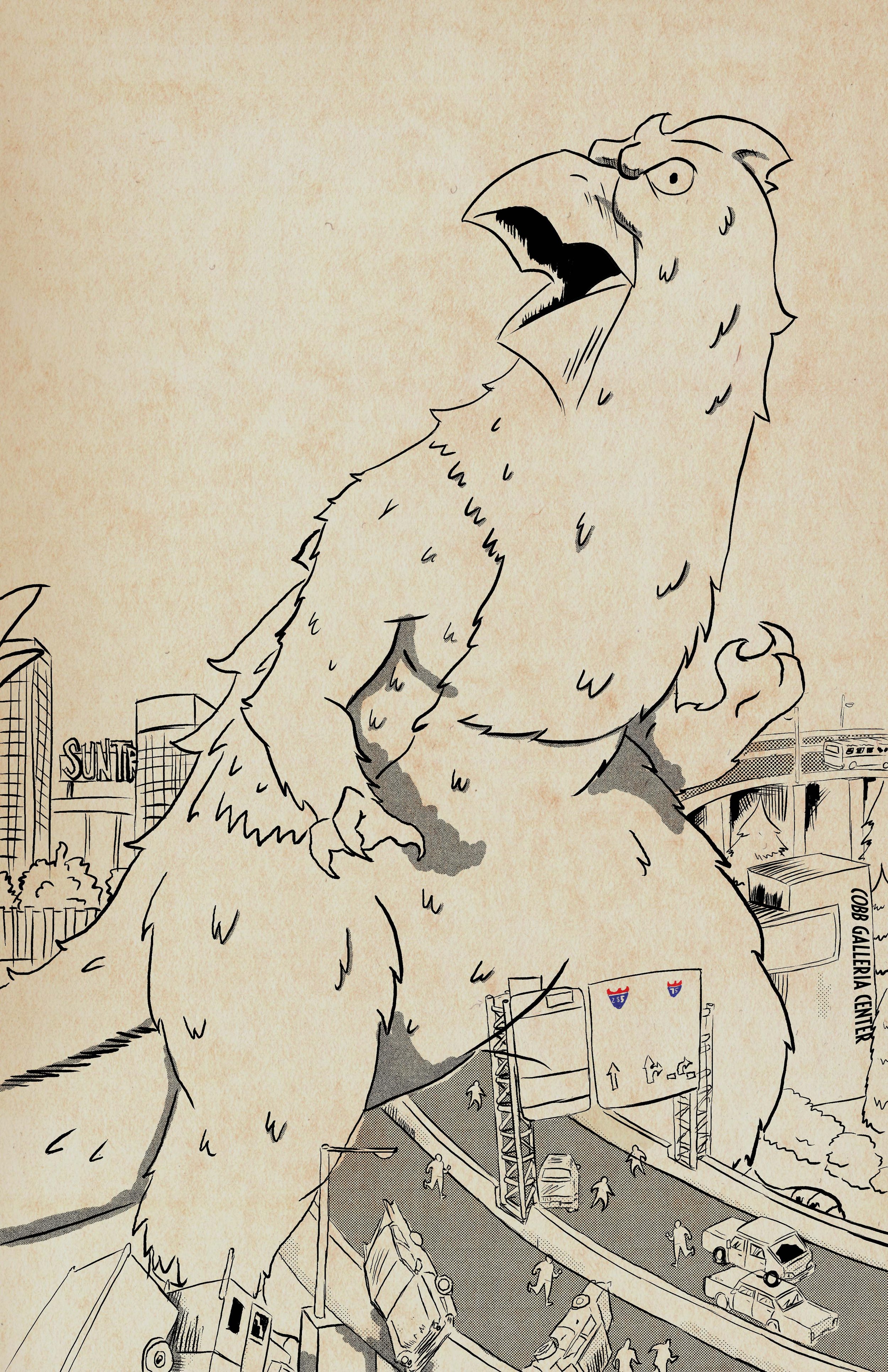
I began to rough out the composition of Cobbzilla employing the design of an isosceles triangle to bring forth the familiarity of the Big Chicken as it sits on Cobb Parkway and Roswell Road.
There's something about the energy that pencil and paper transfer into a drawing that to me is unmatched by its digital counterpart.
So, once I've scribbled in my central figure with a red-colored pencil and built it out with a 0.7 mechanical pencil, I decide to transfer the drawing onto 9x12 Strathmore tracing paper.
This way, I wasn't overloaded with the tangle of lines laid out while building up the figure. This helps because my next step was to render in the background depicting the busy intersection of I-285 and I-75, as well as (then) SunTrust park and Cobb Galleria.
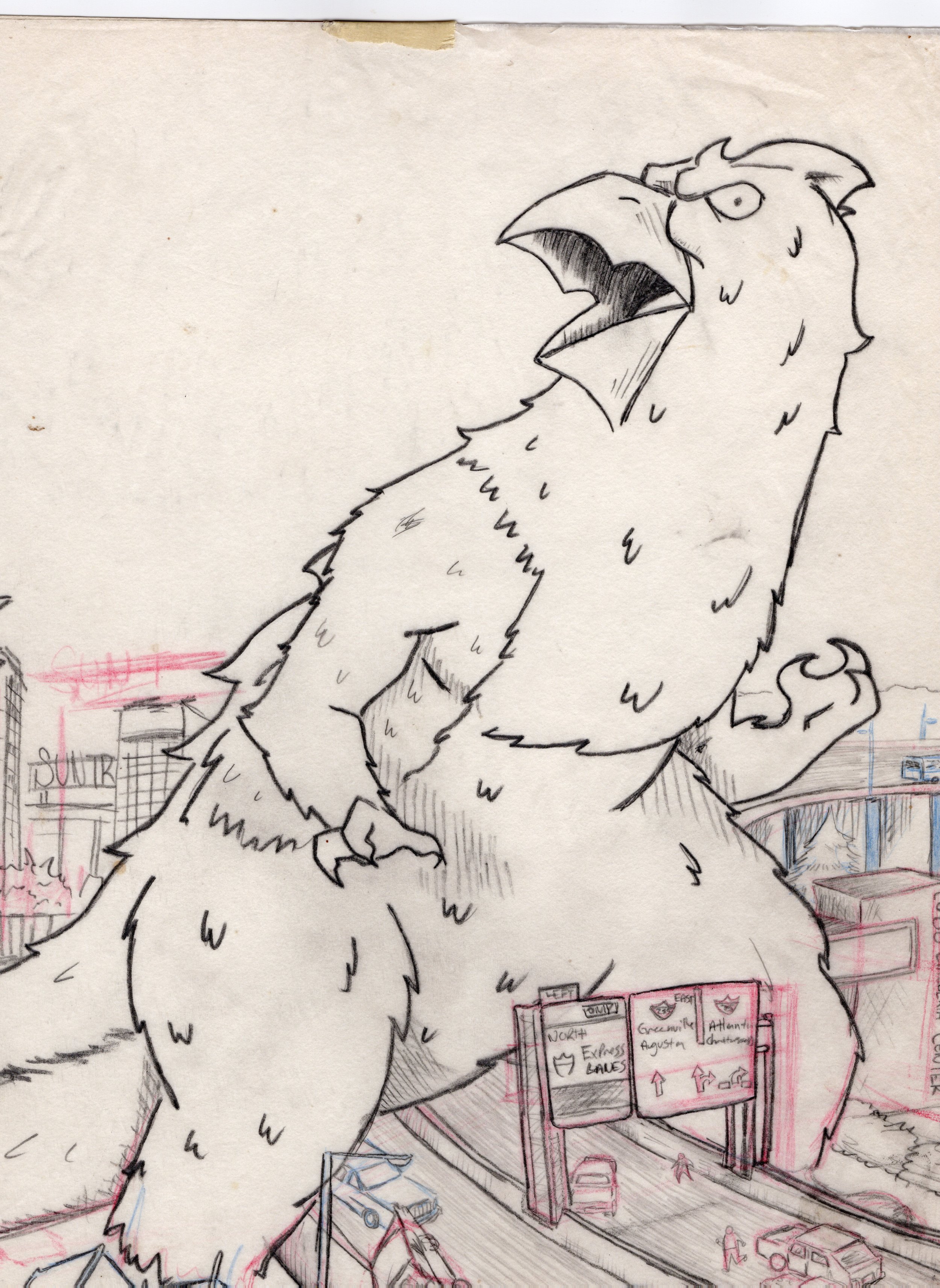
After I layed out the scene in red and blue pencil, then finished it with Graphite and mechanical ( using darker lines for my foreground and thin mechanical lines for the finer details and background which adds a sense of depth) I switched to digital, taking my mighty cartoonist pen and kicking it into high gear with a cache of digital ink brushes and tool kits in Photoshop.
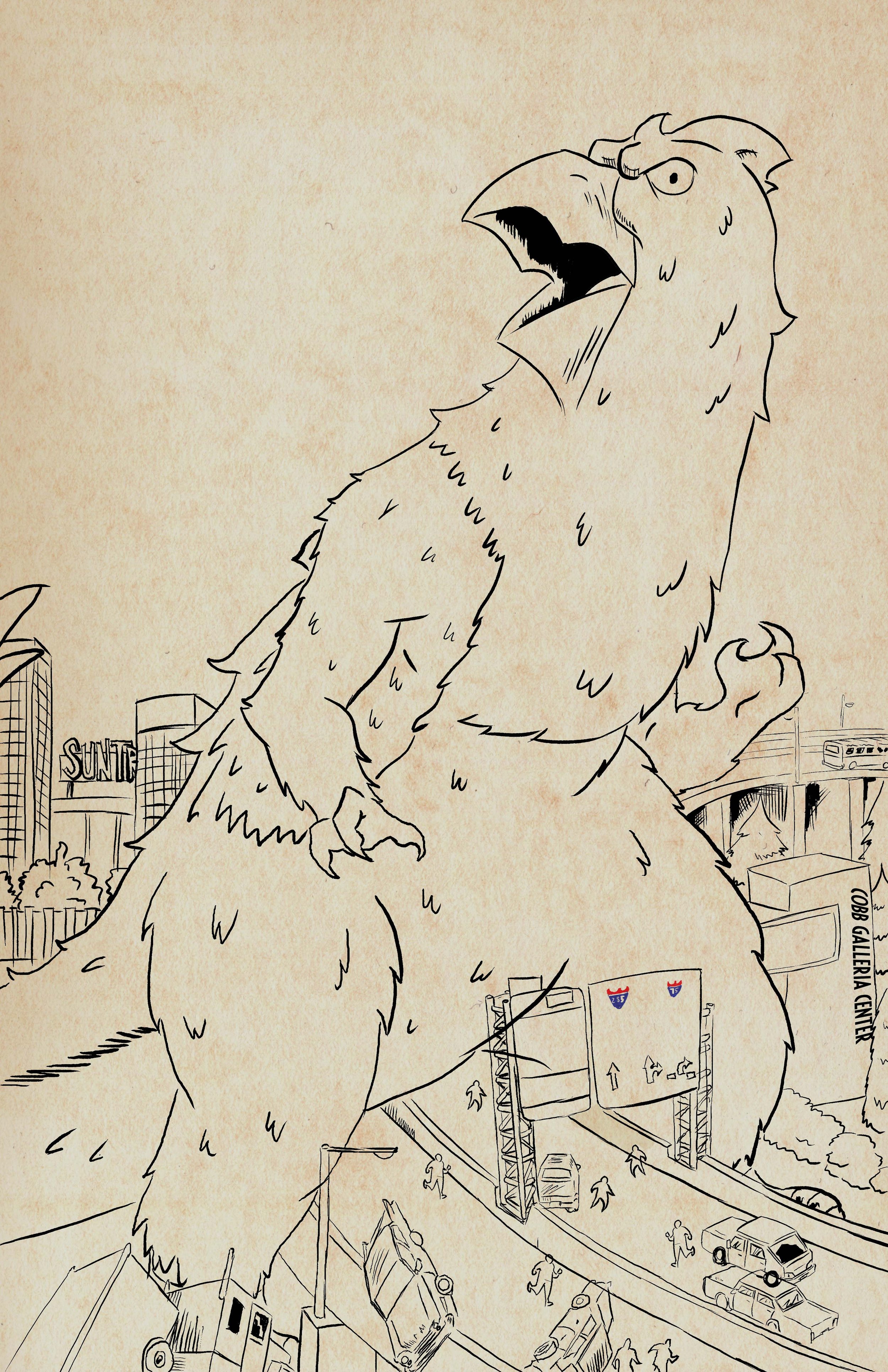
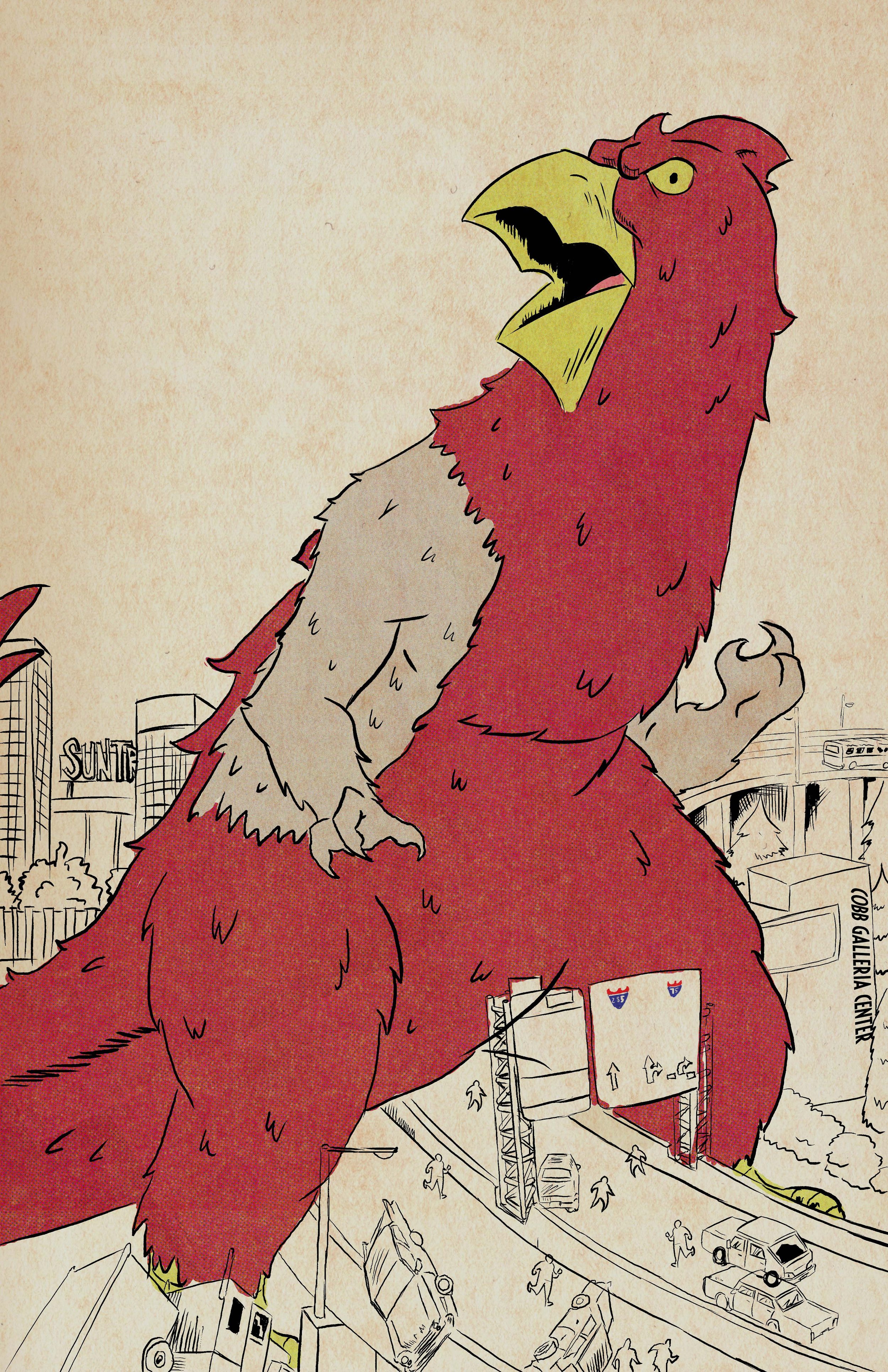
Now, when you’ve got a kaiju-sized chicken stomping through Cobb County, you’ve got to make sure that baby pops! To give Cobbzilla the star power it deserves, I inked it with a heavier line weight using Alex Dukal's set of cartoonist’s brushes.
keeping the focus squarely on the towering terror at the center of this graphic. For the background highway and some shadow areas, I used a set of halftones to create a mid-tone of depth.
Finishing off the inking of I added the pièce de résistance—the silhouette of Mighty Marietta landmark replacing the 'A' in Attack! A little visual wordplay never hurt anyone, right?
As I moved into the coloring stage, I had one mission: retro vibes, full throttle! I busted out the Debaser Toolkit from True Grit Texture Supply to give this piece that authentic, old-school comic book feel. We're talking classic four-color process here—cyan, magenta, yellow, and black, stacked in quartered ranges of 25% to 100%.
In the golden days of comics, you had a limited palette, but with the right touch, you could make those primaries sing across the page! Cobbzilla had to pop off the paper like a Saturday morning cartoon—vivid, vibrant, and demanding attention from across the room.
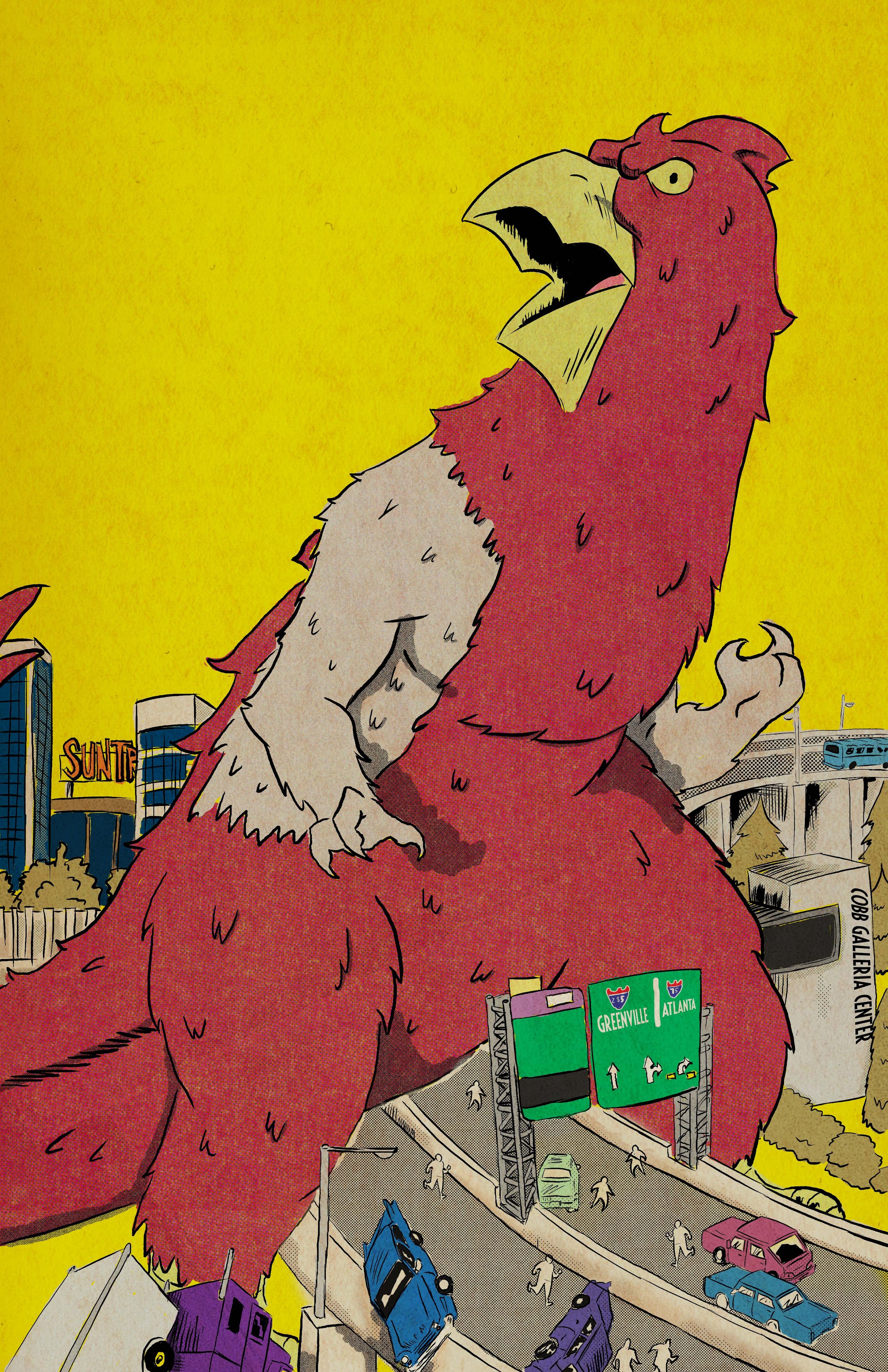
Of course, no retro comic homage is complete without a little wear and tear, right? I pushed that nostalgic look a little further with some subtle distressing (I found a set I liked on the website 'Creative Market'), adding just enough grunge for that authentic touch, but fear not! This distressing is strategically placed to let Cobbzilla strut his stuff without distraction—just a little seasoning to bring that vintage charm to life.
And that, my friends, is the process in which Attack of the 56ft Chicken was brought to life!